
Jacques Cartier & Champlain Bridges
WEBSITE REDESIGNROLE
UX Architecture, UI Design, Responsive Web
CONTEXT
High-traffic public infrastructure platform
YEAR
2021
Project Overview
Jacques Cartier & Champlain Bridges (JCCB) manages key transportation infrastructure across Quebec, serving daily commuters, pedestrians, and cyclists.
The organization launched a new website to support its mobility-first vision, with a strong focus on accessibility, clarity, and mobile usage. Nearly half of visitors access the platform from mobile devices, making speed and usability essential.
The goal was to modernize the experience, simplify access to critical information, and create a structure that reflected how people actually navigate transportation content.

Standardized page structures to make dense information easier to scan and maintain at scale.
Clarity at scale
2,200+ pages → ~1,070 pages
Nearly 50% content reduction through consolidation, restructuring, and standardized templates, improving clarity and long-term maintainability.
~50% of traffic on mobile devices
The entire experience was designed mobile-first for on-the-go usage.
The problem
Over time, the JCCB website had grown into a dense and fragmented platform. Content was spread across thousands of pages with inconsistent layouts and deep navigation levels.
Users had difficulty quickly finding essential information such as traffic conditions, mobility paths, and infrastructure updates, particularly on mobile devices where speed and clarity matter most.
The platform needed not just a visual refresh, but a fundamental restructuring.


The approach
I focused on creating clarity at every level of the experience.
First, I restructured the information architecture to reflect real user priorities, flattening navigation hierarchies and grouping content into intuitive sections.
Next, I designed mobile-first layouts that prioritized critical information, ensuring users could access real-time updates in seconds rather than minutes.
Finally, I introduced a consistent UI system with standardized page templates, improved typography, and clean component patterns to support dense informational content.
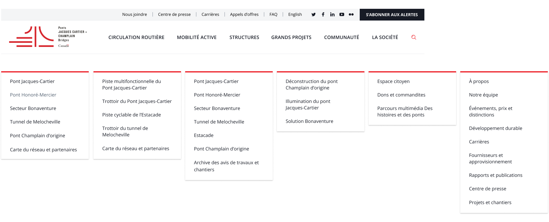
Restructured site architecture around real user priorities rather than legacy content groupings.
Desktop navigation
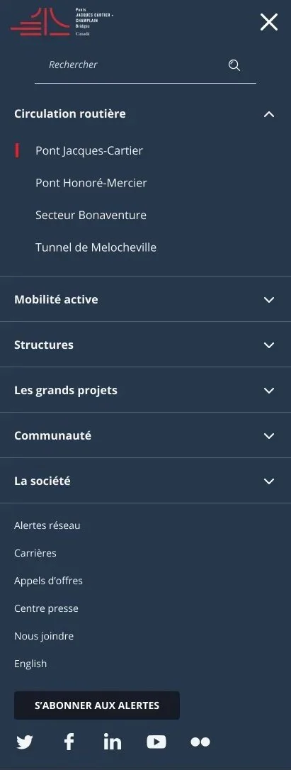
Mobile navigation
The result
The new JCCB website delivers a significantly clearer and more usable experience across a large content ecosystem.
Users can now access critical mobility information faster, navigate intuitively across devices, and engage with a modern public platform built for real-world usage.
